
Can Fonts be Eco-Friendly?

One of the many popular conversations we’ve noticed online in green graphic design spaces is the discussion around choosing eco-friendly or green fonts. The logic behind this is that by choosing a font that requires less ink will lead to meaningful reductions in ink waste on a project and thereby have a positive environmental impact.
So is this really true? Can your font choice actually hurt the environment? Where did this idea come from? We’re going to break all of this down, and hopefully, alleviate some of your guilt and eco-anxiety around the matter.
First, we have to start by understand ink use in print design.
Ink use is an important thing to consider in green graphic design. Traditional inks are composed of petroleum-based formulations, meaning that they contribute to a reliance on fossil fuel extraction in order to create them. Plant- and vegetable-based inks and soy-based inks are growing in popularity, and offer a more sustainable alternative that is better for the environment. Plant-based inks both reduce the reliance on unsustainable extraction of unrenewable resources and emit less air pollution (or VOCs/Volatile Organic Compounds) into the air when they dry. Vegetable derived inks naturally have less VOCs, as less petroleum is used in the formulation.
Unfortunately, not all plant-based inks are made alike. There is no regulation on their concentration, so make sure to ask what percentage of the formula is vegetable based and what is petroleum-based. Plant-based inks are usually more vibrant than traditional inks which is honestly a win for us sustainable designers.
So how much does ink matter? How does it compare to the impact of material choice that the ink is printed on?
The truth is that inks make up 1% or less of the material used in a project. So by percentage, they're the least important element of sustainability. This is a hard and fast rule for packaging and print design. The material cost and carbon emissions associated with the material make up the vast majority of the impact of any print project. The environmental savings you can achieve by switching from a virgin stock to a recycled stock are significant and meaningful. The larger the scale of the project you’re printing the more meaningful those carbon footprint savings are.

Then what about eco friendly font choices?! If all ink coverage on any print piece is less than 1%, the amount of ink use in your font choice is even less. This is why I don't think it's particularly useful to stress over what font you use, and whether or not it's eco friendly, and how much space is taking up. When choosing fonts we need to consider more than just ink use. We need to think about legibility, accessibility, and also the branding for the client.
So why is everyone talking about eco-friendly fonts?
It all started in 2014, when a sixth grader proposed he could save the government over $400 million by switching to a different font that used less ink toner and thereby saved ink and money. Unfortunately, it's not so easy. His recommendation was to switch the government font to Garamond from Times New Roman because there would be a 30% savings of ink and money. But there is one fundamental problem: Garamond is a thinner font.

According to John Brownlee, a designer and writer for Fast Company, to have the same legibility and accessibility as something like Times New Roman, you need to increase the font size. When the font size is increased the ink savings vanish. This is mostly partly due to the font’s x-height of Garamond being much lower than Times New Roman. To create the same legibility as Times New Roman, and to ensure the government documents would be accessible to all, the font size of Garamond would have to increase, effectively eliminating all ink savings.
We cannot abandon accessibility of information and design in our work simply to save a minuscule amount of ink. We must ensure our messaging and design doesn’t exclude others.
So the takeaway?
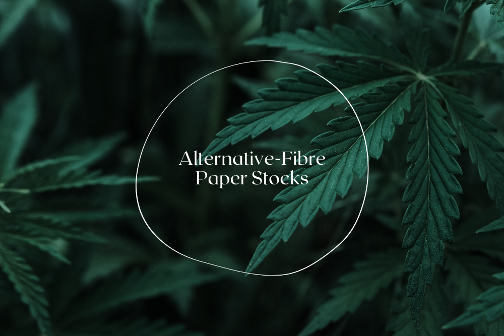
I encourage you not to worry too much about your fonts, have fun, and honestly, it is one of the least important choices that you can make in terms of green graphic design. It's much more valuable to be considering your paper stock options, printing method and also the type of ink being used. We can fall into decision fatigue as green graphic designers and it’s important to put your energy into the areas where you can have the most meaningful impact.
Sources:
Brownlee, John, and John Brownlee. “Why Garamond Won’t Save The Government $467 Million A Year.” Fast Company, March 31, 2014. https://www.fastcompany.com/3028436/why-garamond-wont-save-the-government-467-million-a-year.
CNN, Madeleine Stix. “Teen to Government: Change Your Typeface, Save Millions.” CNN, March 28, 2014. https://www.cnn.com/2014/03/27/living/student-money-saving-typeface-garamond-schools/index.html.
Continue Learning!


FOR CLIENTS
Want to take the overwhelm out of researching exactly the right stock option for your sustainable packaging? We can help.

FOR DESIGNERS